Rebranding process for Iara Snei
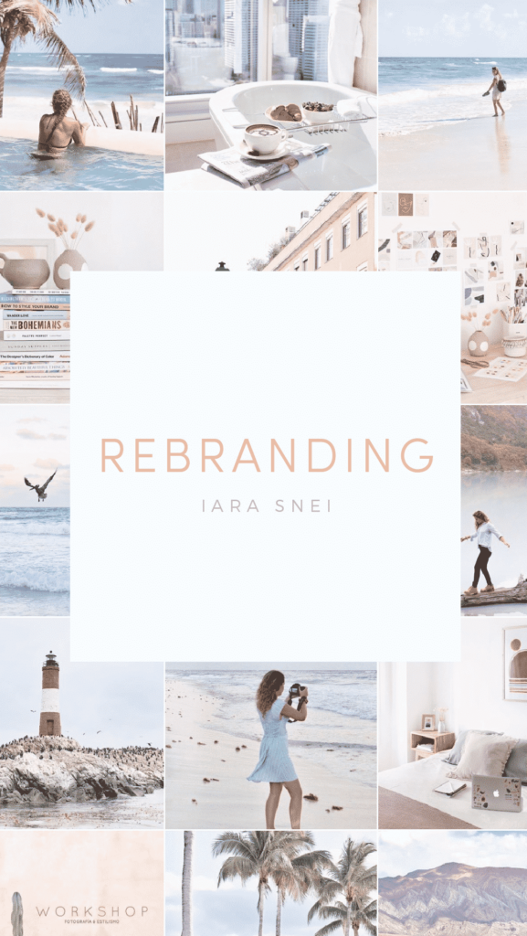
Imagery with soul and travel bug
I’m so excited to share with you all the amazing rebranding process we did for my darling friend Iara Snei. Iara is an incredible photographer and traveler based in Argentina. After my first trip to NYC, Iara and I connected through Instagram and became IG Pen Pals ever since.
We share travel tips, talk about upcoming projects and we really became true fans of each others work. So that’s how I ended up designing her rebranding and gave a new brand identity that really show her identity.
This rebranding turned out so beautiful that I wanted to share with you all the step-by-step we did with Iara to translate all of her creativity and amazingness into her branding.
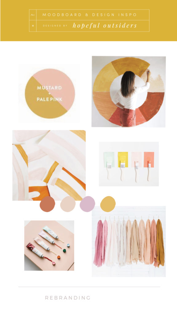
1. Moodboard & Design Inspo
Before even thinking about what type of branding Iara wanted we talked and selected a bunch of images that spoke to her on what she wanted her rebranding to look like. We talked about colors, textures and an overall look & feel of what really inspires her.
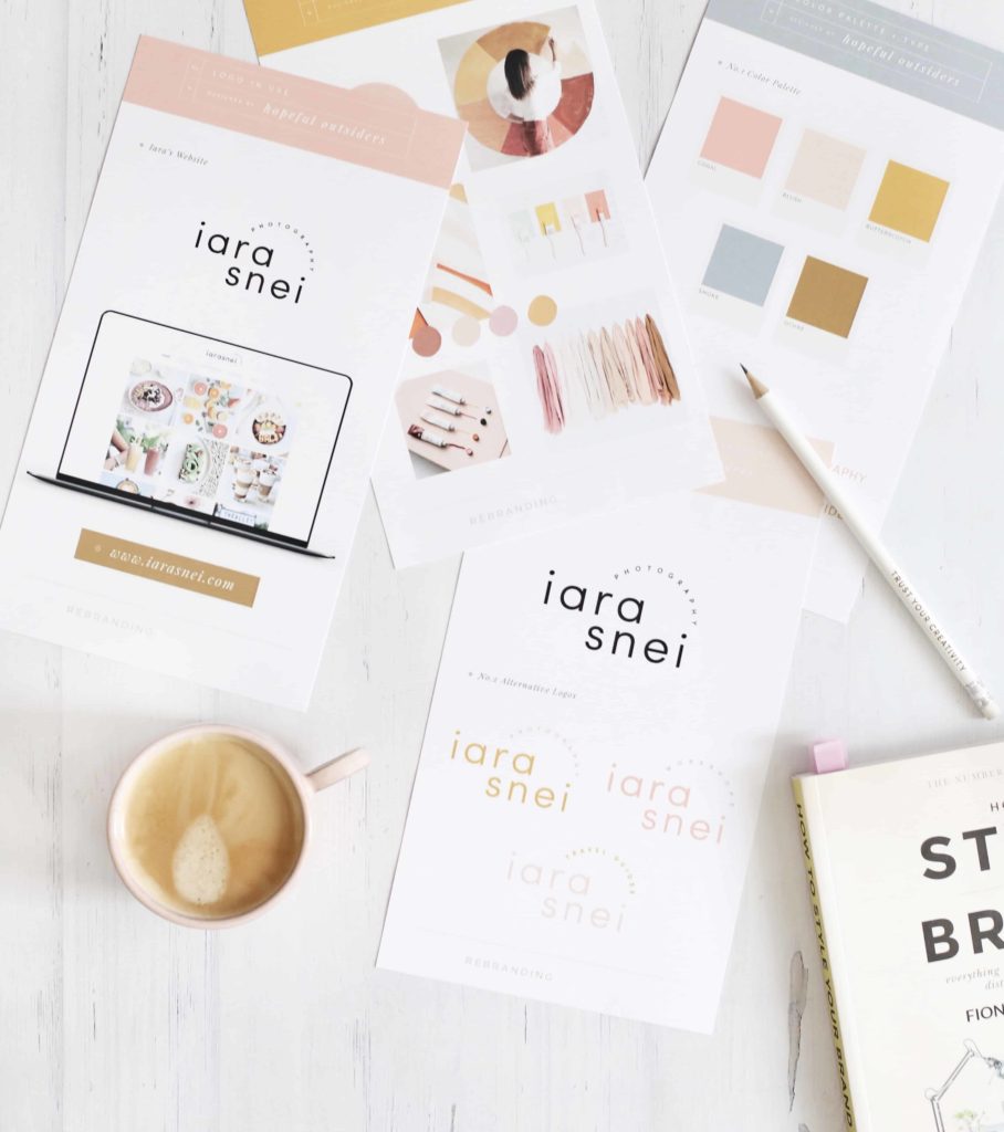
After that it was pretty easy to see that Iara wanted a clean design yet feminine & playful with a warm tone color palette and that led to this beautiful mood board that helped guide the entire design process.
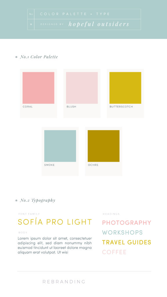
2. Color Palette & Type
After getting to know a little bit more about Iara’s color preference, the look & feel she wanted for her brand we picked a primary and secondary color palette for her rebranding. Blush, mustard as primary colors and a few accents colors to help balance it out for a more cohesive look.
For type I knew Iara would be more drawn to a sans serif font that could be more playful and give a clean look so we choose Sofía Pro Light as her main typeface.
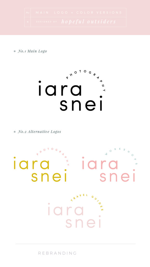
3. Main logo & Color Versions
With all the groundwork completed, the mood board, the color palette and the overall look & feel for Iara’s rebranding I got to work. I have to say this rebranding was so fun to design mostly because I already knew Iara’s style and wanted the design to look as amazing as her work.
A design easy to use in all of her platforms, clean but also a visual statement. So this was the first and only proposal I handed to her and she LOVED IT.
The design was thought out for her to be able to use it depending on her work categories such as travel guides, photography, workshops, etc.
4. Logos in Use
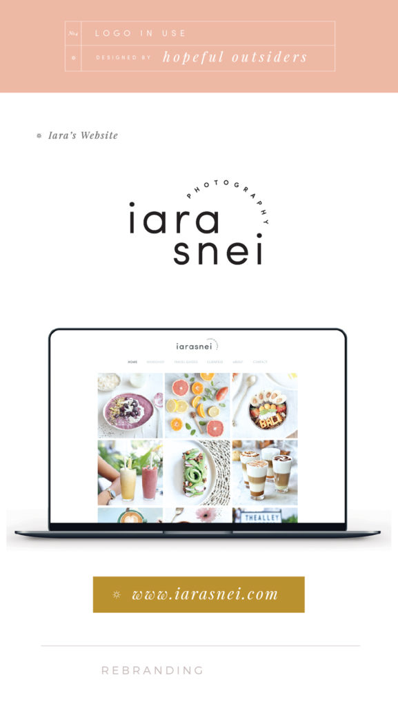
Before sending any design for approval I like to give my clients an design layout where they can see their rebranding in use in their platforms. So for Iara I included the proposal on her website so she could have a clear look on how her new rebranding would look in her website along side her work. And I have to say it ended up looking GREAT!
A black & white logo was used so it wouldn’t compete with what was the focal point on her website which was her photography.
The Magic behind Iara’s Rebranding Process
I love working with creatives that inspire me! Their work, their creativity and their way of showcasing their experiences all over their platforms really inspires me.
This rebranding process was by far one of my favorites. Iara’s work is absolutely stunning and her adventurous heart and way of seeing life still makes me fall in love with her work even more every single day.
Be sure to follow Iara on Instagram and show her some love, she is really AMAZING. You can follow her on IG as @iarasnei
Thank you Iara for letting me give life and a little bit of magic to your brand identity! You’re the best IG pen pal and friend someone could ask for!
Let me know if you would like more design content and a little bit of the behind the scenes on my work as a designer!
Till next time!
Ka
CATEGORY
10/13/2019
POSTED
Rebranding process for Iara Snei
Explore the blog
Lifestyle
Lifestyle
Design
Travel
Entertaining
Hi! I'm Karina
I'm a content creator, designer and photographer based in Costa Rica & Miami. I'm an iced latte lover, Sagittarius soul, travel enthusiast that loves to create genuine and real lifestyle content for brands.